Inovasi Daya Solusi needed a dedicated fraud detection dashboard built entirely from scratch. The platform needed to surface suspicious transactions, manage blocked users, and configure risk rules — all within a single, cohesive interface.
I designed the complete product end-to-end, aligning it with the visual language of the existing main dashboard to maintain consistency across the company's ecosystem while tailoring it specifically to the needs of fraud monitoring workflows.
The primary users of this dashboard would be C-level executives — specifically the CEO and CFO. This introduced a unique design constraint: the interface had to be simple enough for non-technical users to navigate comfortably, while still being comprehensive enough to surface all the critical fraud data they needed to make decisions.
Balancing aesthetic clarity with functional depth was the core challenge. Every element had to earn its place on the screen — no unnecessary complexity, no missing information. The design needed to communicate trust and authority at a glance, without requiring a learning curve.
C-Suite
Target Audience
From Scratch
Built End-to-End
The design process was highly iterative. Because the client had a clear but evolving vision, there was significant back-and-forth throughout the project. The dashboard went through multiple phases — each round of feedback reshaped the layout, the data being surfaced, and how information was prioritised. What started as a focused transactions view in Phase 1 evolved into a richer dashboard with trend charts, risk scores, and distribution breakdowns in Phase 2.
Adding to the complexity, the client's availability was limited — meetings were difficult to schedule and often spaced apart. This meant I had to be proactive in anticipating needs, preparing multiple directions in advance, and making the most of every feedback session to keep the project moving forward between rounds of revisions.
Client Feedback & Documentation
* Some content has been blurred to protect company confidentiality.
The process followed a structured but flexible path:
A key insight from testing was that reducing visual noise was more effective than adding explanatory elements. Rather than tooltips and labels, the design relied on clear hierarchy, generous spacing, and familiar patterns to guide users naturally through the data.
Dashboard Clarity:
The dashboard needed to communicate the most critical metrics immediately — suspicious transactions, blocked users, and risk scores — without requiring users to dig through multiple views.
Risk Rules Management:
The risk rules page had to feel manageable rather than technical. Rules are presented as simple cards with clear statuses, making it easy to scan, toggle, and configure without feeling overwhelmed.
User Detail Panel:
Blocked user details needed to be accessible in context — a side panel approach was chosen so executives could review user information without losing their place in the main list.
The final product delivered a clean, focused interface that gave executives exactly what they needed — a clear view of fraud activity, the ability to manage risk rules, and detailed user profiles — all without unnecessary complexity.
This project reinforced a principle that is easy to overlook: simplicity is not the absence of depth — it is the result of it. Every screen went through multiple iterations to strip away what wasn't essential while preserving what was. The most effective design decisions were often about what to remove, not what to add.
Working with limited client availability also taught me the value of self-direction and preparation. By coming to each session with multiple options and clear rationale, I was able to keep the project moving forward despite scheduling constraints.
If I could revisit this project, I would advocate for more direct access to the end users earlier in the process. While the client provided great direction, first-hand observation of how the CEO and CFO interact with data tools would have sharpened the design even further.
* All screens use dummy data to protect client confidentiality.
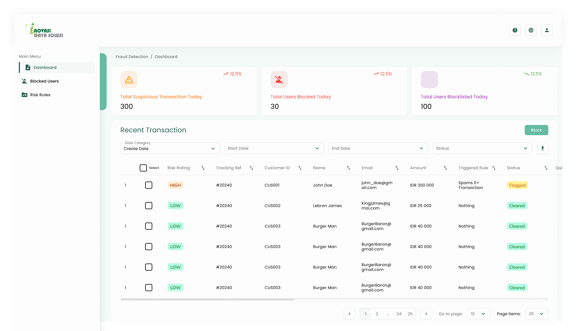
Dashboard — Phase 1
The initial dashboard design focused on surfacing key metrics and the recent transactions table. This version was presented to the client for early feedback.
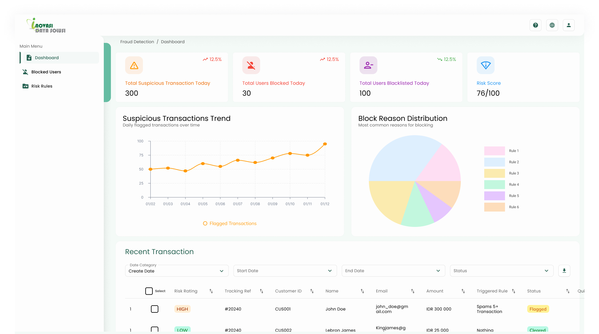
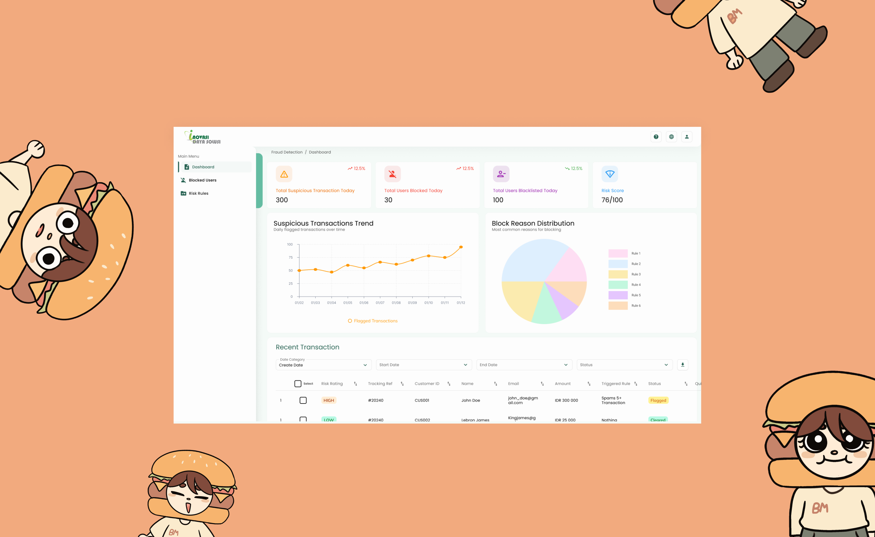
Dashboard — Phase 2
After client feedback, the dashboard was refined — adding a risk score indicator, suspicious transaction trend chart, and block reason distribution to give executives a fuller picture at a glance.
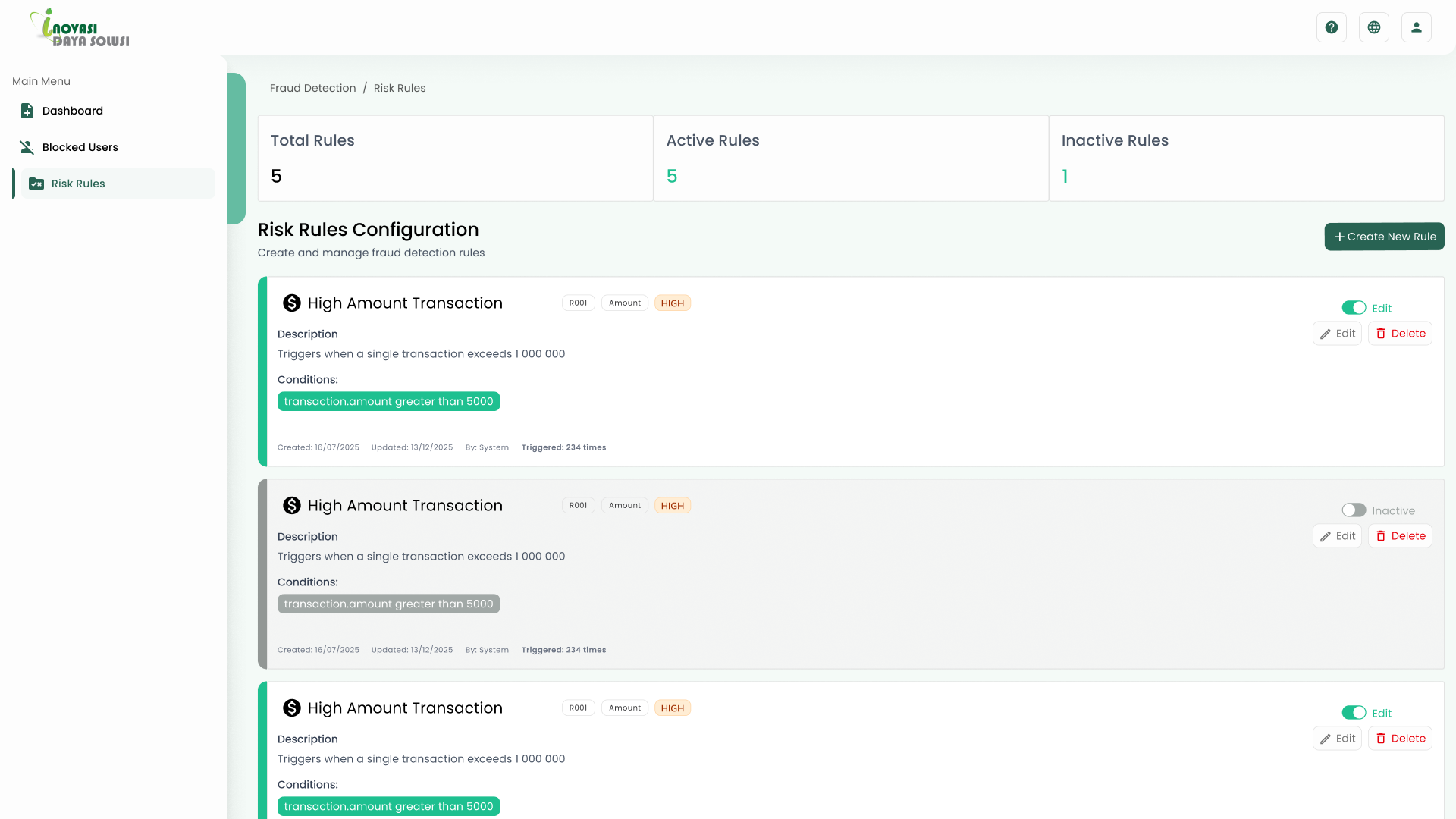
Risk Rules — Phase 1
Initial prototype exploring the risk rules configuration layout — testing how rules, conditions, and actions could be presented clearly.
Risk Rules — Phase 2
Refined design after client feedback — simplified to a clean card layout with toggles for managing active and inactive rules.
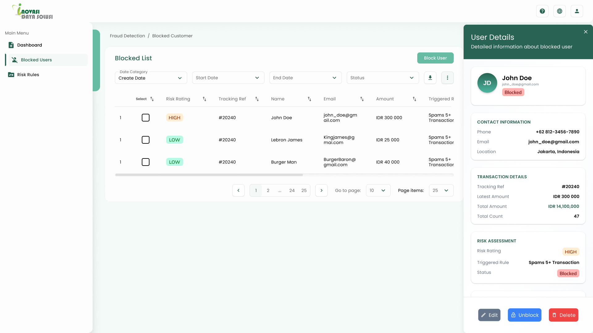
Blocked Users — Detail Panel
Side panel showing user contact info, transaction details, and risk assessment — accessible without leaving the blocked list.