Inovasi Daya Solusi is an aggregator platform that handles large transaction volumes and complex data workflows. The existing interface had become outdated, with cluttered layouts, inconsistent components, and a lack of clear visual hierarchy, making day-to-day use more difficult than necessary.
I worked with other UI/UX designers to rebuild the interface from the ground up, creating a cleaner and more scalable product. This included designing a new AI-powered page directly connected to the model.
The old platform had two compounding issues. First, the dashboard felt heavy and unintuitive — cluttered with information, hard to navigate, and visually inconsistent. Users were avoiding key parts of the product simply because the friction was too high.
Second, the AI feature buried inside the old dashboard had below 10% engagement. Users didn't trust it, didn't understand it, and couldn't easily find it. A powerful tool was going completely to waste because the interface failed to surface it properly.
<10%
Usage Rate
High
User Friction
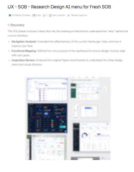
Before touching any screens, the team carried out structured research. We studied competitor platforms to understand what was working in the space and where the gaps were. We also spoke directly with the people who would be using the product daily — understanding their workflows, frustrations, and what customisations the company needed.
Competitor Analysis
That research directly shaped the design decisions: the navigation structure, the information hierarchy, and which features to surface up front.
The process followed a clear path:
After developing a working high-fidelity prototype, we conducted scenario-based task usability testing to evaluate how effectively users could interact with the AI features within realistic workflows.
AI Panel Placement:
One key finding was that placing the AI panel on the right side of the interface improves workflow efficiency. Users reported that this positioning avoids conflict with the primary navigation sidebar on the left and allows them to multitask more easily while referencing AI responses alongside their main tasks.
AI Summarisation:
AI summarisation significantly improves efficiency when working with complex data because users can quickly understand key information without manually reviewing large datasets.
Navigation Clarity:
Navigation between AI states (minimised, pop-up, full-page) is unclear because users could not easily find how to expand the chat to the main AI page.
The redesigned dashboard brought immediate clarity to the platform. Navigation was simplified, the visual hierarchy was restored, and users could find what they needed with less friction.
The AI page, which was previously buried and overlooked, became a standalone feature with its own dedicated interface. By giving it sufficient space and a clear entry point, engagement improved significantly.
Looking back, the biggest lesson was the importance of structured research before beginning any design work. Competitor analysis and user conversations informed every major decision and helped prevent the team from designing without direction.
Working within a live product also taught me to balance ideal design with practical constraints — coordinating with developers, adapting to technical limitations, and iterating quickly based on feedback.
If I could revisit this project, I would push for more rounds of usability testing earlier in the process to validate assumptions sooner and reduce late-stage revisions.
Research & Documentation
* Some content has been blurred to protect company confidentiality.
-Rod9Nsh3.png)
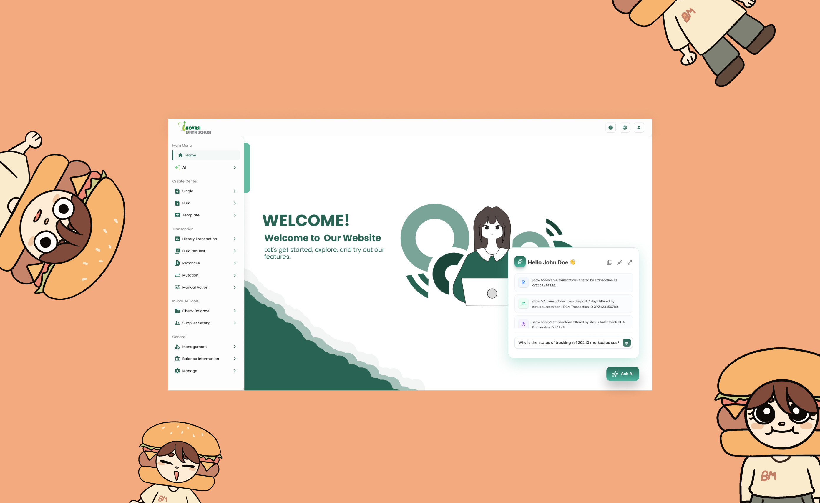
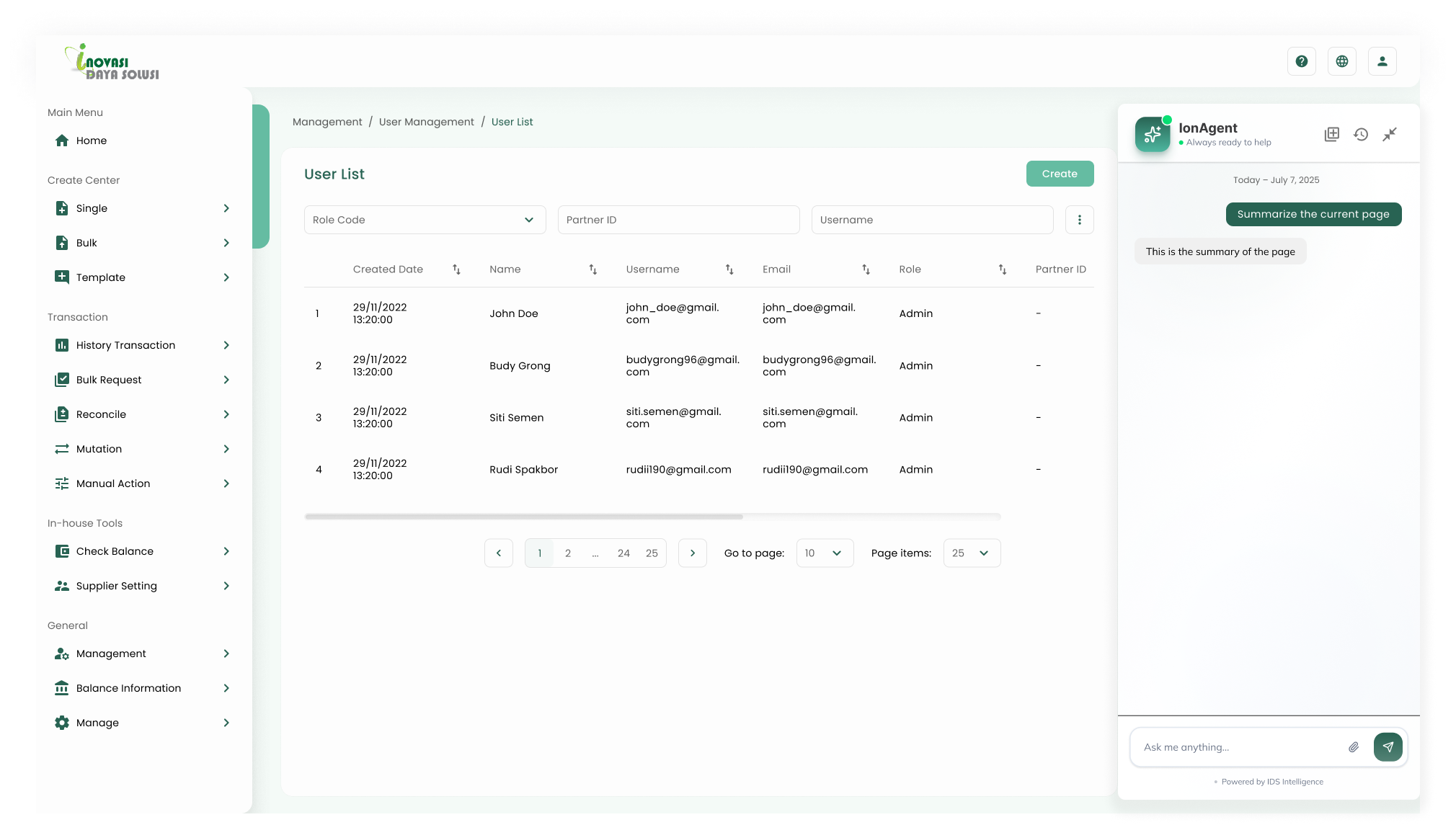
AI Page
A dedicated AI chat interface — users can interact directly with the model, built natively into the platform.
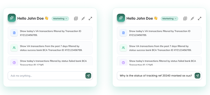
Popup
Small popup for quick AI access on the main page.
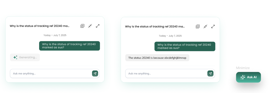
Popup
Expanded popup for deeper interactions on the main page.
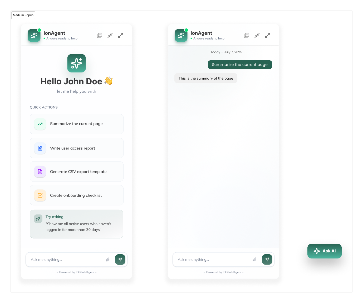
Medium Popup
For data-heavy interactions — keeps both the underlying data and popup visible simultaneously.
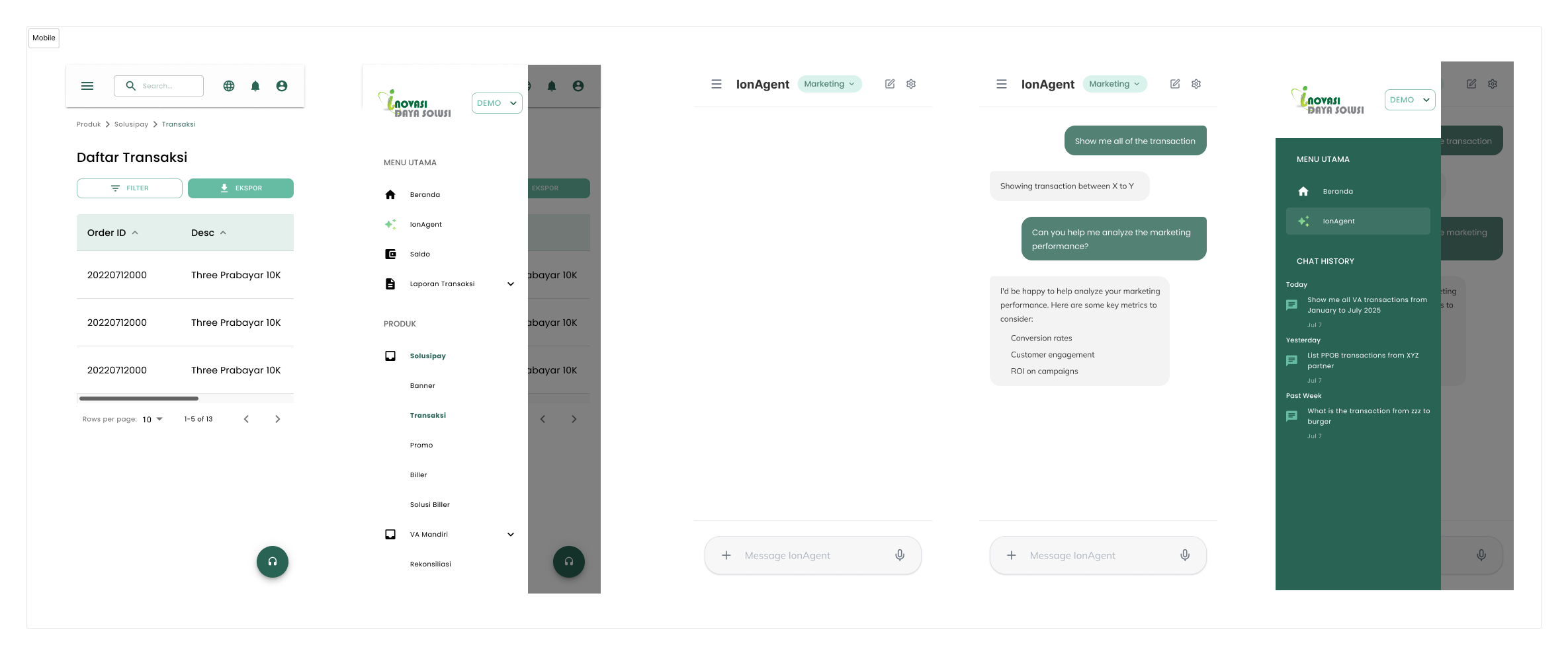
Mobile View
The redesigned dashboard fully adapted for mobile screens.